UNI MODULE
One of my first modules at uni. Creating a variety of different print-based advertisements.
All product names, logos, and brands are property of their owners. All company, product and service names used on this page are for educational purposes only. Use of these names, logos, and brands does not imply endorsement.
Brief One - 3 Bad Ads
This brief was to find and transform three bad pieces of print advertising, and honestly finding bad ads online was hard enough. It took me hours to find ads that I wanted to redo, but eventually, I landed on three which I then spun off and created new pieces from.

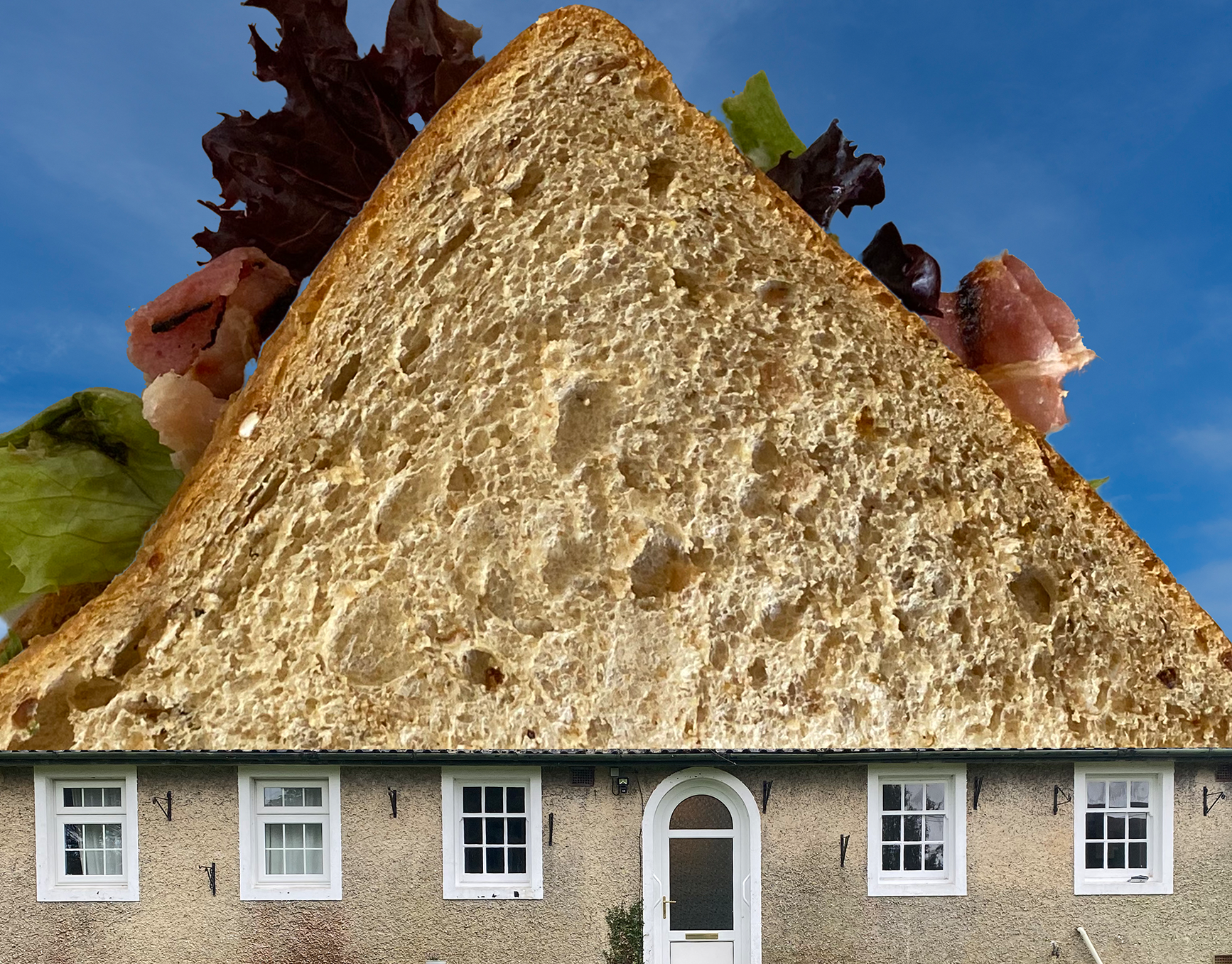
I decided to keep the same copy (bar the "New Pink Lemonade") but I changed the tone. Instead of being shocked and surprised, it is sassy and sarcastic.

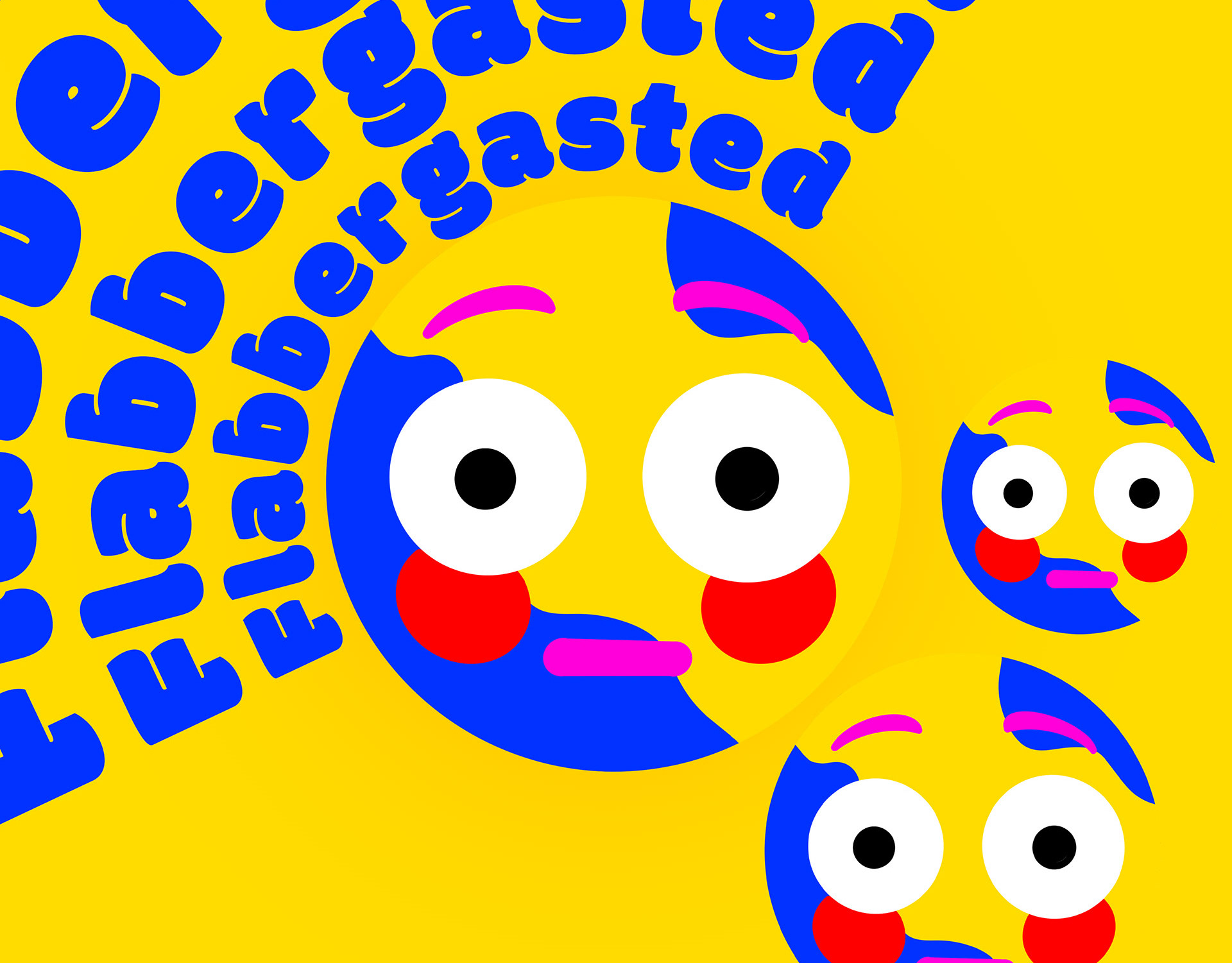
So to start with this ad I took the word "Refreshing" from the original and thought about the different meanings and interpretations. Eventually, after a lot of different ideas, I landed on the most irritating and well known refreshing symbol.

For this remake, I looked at the copy that is always in a Cadburys advert "smooth and creamy" and developed the word smooth. The individual pieces of chocolate reminded me of a keyboard, so I built on this and created a cheeky pun with the copy and placed it onto the keycaps. PLEASE NOTE: The keyboard image is not mine, all rights remain with the owner/creator, I used it purely for educational purposes.
Brief Two - New Print Ads
This brief was to produce original print ads for three products, as chosen by the wheel of fate. These definitely weren't the ones I would've picked but in a professional setting, you can't choose your briefs.

AD 1 - Smiletime Teeth Whitening Kit. For this I decided to use paint chips/samples as the basis for the design. As it's a teeth whitening kit I used yellow chips and simple copy to illustrate the purpose of the product - to brighten your teeth.

AD 2 - The VW ID Buzz. This ad I decided to play on the fact the care was a concept that is entering production. I went for a gradient and sketched effect to make it look like a blue print - or a concept becoming reality.